

Content
Premise
Objective
Unpack+Define
The Schedule
Synthesis
Big Picture
“Our day to day changes so much. Some people quit the day of their shift, leaving me as a scheduler, scrambling to find a replacement, and sometimes I can’t! When I can’t find a replacement, I have to switch hats to fill that gap myself. So now I have two jobs.””
Premise
Scheduling employees in the world of long-term/senior living care can be cumbersome and can sometimes seem impossible to the individuals responsible for those tasks. Facilities worry about the regulated requirements for the amount of care they’re providing while juggling the flakiness of employees that often don’t show up to work a designated shift or quit entirely due to better, and easier, compensation being available at other businesses (McDonald’s or Walmart). The experience of scheduling is stressful, and while many things are on the table to address, a significant component of the experience is the tool that is used for scheduling.
Objective
I was 1 of 2 design consultants brought in on a six month endeavor to redesign and improve the user experience of the scheduling software offered by an award-winning workforce management company* and set the stage for a suite of additional products to follow.
*For the sake of NDAs, some details have been modified.
Unpack + Define
Understanding
Before any form of solutioning was introduced, we wanted to develop empathy for the target end users and understand where the gaps existed. We also wanted to understand what the business wanted to achieve to ensure we addressed and synthesized value for all parties as best as we could.
Define the users
Define the needs (value stories, jobs to be done, metrics for success)
Review client’s existing scheduling web app and software
Review competitors
Primary Users
Several initial interviews were conducted with the individuals that were identified to be the primary users of the tool we were rebuilding, but one persona became a clear central focus - the Scheduler. Being considered the “heartbeat of operations” of their respective facilities, the Scheduler had the most usage and encountered the most day to day stressors.
Other personas included individuals that would engage with the tool on and off at different levels such as the Building Administrator, Regional Executive, Corporate Executive and of course the Care Provider, which is the next frequent and essential user.

Image taken from the office of a Scheduler with imagery and reminders to reduce stress
Initial Revelations
The first wave of requests all revolved around cleaning up the user interface. Many users expressed that they were okay with the current tool but it was very cumbersome and lacked a few features that would make life easier.
Most Schedulers desired a wholistic view of their days - what their daily requirements were not only for that day, but also per shift and if those requirements were being met. These daily requirements were an industry wide standard and were scrutinized by the State so it was important for the business to provide this visibility in their product for users to track and report.
If daily requirements weren’t being met, Schedulers needed to know when and where to allocate resources.
In addition to being able to see the granular details of their day, Schedulers also needed the ability to see an overview of their week to identify gaps down the road and not be caught off guard.
Due to high turnover and the nature of employees calling off at the last minute, Schedulers expressed a desire to be able to communicate quickly and efficiently with staff in an attempt to reallocate available resources to fill these gaps.
If a specific employee wasn’t able to work due to time off or other miscellaneous reasons, schedulers needed quick visibility to know not to expect that employee to work their typical shift or to not contact them to work an open shift.
Schedulers needed to be able to quickly identify the roles of various employees and if employees were coming close to or in overtime. The concept of tracking hours and overtime was an important consideration for the business as well, because this would provide an opportunity to reduce costs for individual facilities that utilized their product.
The Scheduler
Scope
With the primary end-users defined, we facilitated a discovery/scoping session to understand what all of the critical issues were relative to the respective personas we identified. Based on those issues and desires, we generated features that could make the tool we were rebuilding as useful as it could be. Although the intent was to release a thin slice for an early release MVP, we used this time to take a broad stroke and brought visibility to some ‘delighters’ and other potential out-of-scope desires.


Configure New Company
Labor Planning
Manage Schedule
Misc
Business Management
User Management
Subsequent sessions allowed us to chip away at the initial mental dump and begin to massage a journey that eventually led to an outline of a MVP first release.
Setup
Schedule Definition
Shift Manipulation


Release 1
View people on a schedule (Scheduler)
Select a user/position
Assign a user to date/time
View all scheduled shifts (day/week/month)
Modify a shift
Remove a user
View my schedule (Employee)
View my assigned shifts
View available shifts
The Schedule
First Pass Testing
With the insights from the key users and a thin slice for MVP identified, we began to visualize our findings and explore initial concepts, starting with a focus on the Scheduler. Because of this, the initial visualizations revolved around the organization, layout, and structure of the schedule.

Second Pass Monthly View Concept
Second Pass Weekly View
Second Pass Daily View
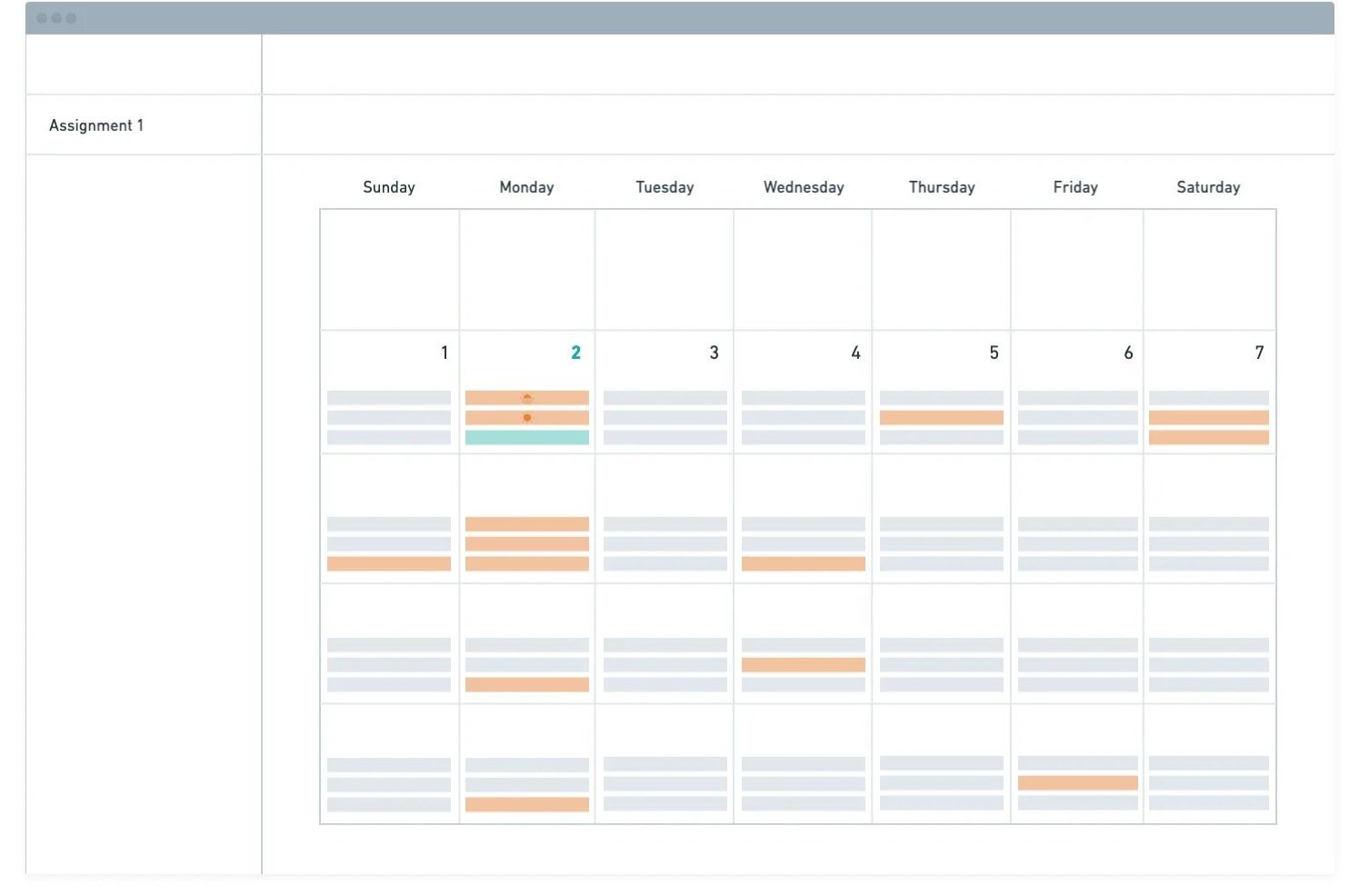
The first few stabs at the schedule were broken out into 3 different levels of detail - a monthly, weekly, and daily view. This was an attempt to give Schedulers the ability to switch between views for the wholistic visibility they desired. We explored various views on both desktop and mobile formats, however, we learned that most facility rules prohibited staff from using their phones while on shift. With that in mind, we pushed some of the exploration of mobile formats back to focus more on the MVP elements that were relevant for our timeline.


User testing was done in person at various care facilities and remotely to vet our initial mockups and to see if we were capturing the uncovered insights from our previous sessions. While there were common remarks across the board, such as questioning the need for a monthly view, one critical call-out was the lack of visibility into the requirements that a facility needed to meet daily.
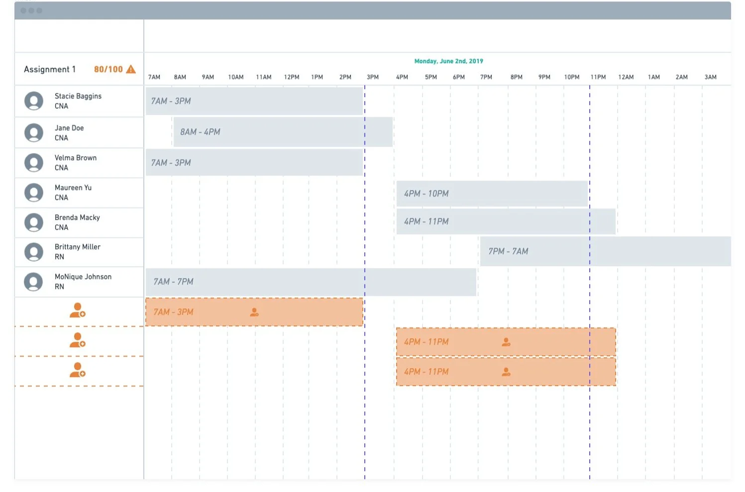
The concept of requirements was crucial because it was the metric utilized to determine if a facility was performing optimally and meeting the state's regulations. This was one of the primary elements that Schedulers needed explicitly surfaced, so they knew precisely where they should assign employees.
While we attempted to address this in a few of the early iterations briefly, it was nowhere near the level of fidelity that our users needed to feel confident in that information. So we took a step back and attempted to break down the hierarchy of a facility to better understand if we were organizing the information correctly and to figure out at what level did this level did requirements need to live.


We discovered that the organization of information that needed to be represented on the schedule broke down into specific elements:
The overall parent organization/company
A community - A collection of buildings or facilities.
A department - A collection of locations within a building.
The department level is where the concept of requirements lived and depending on how a facility was setup, these requirements could be different for specific floors, wings, shifts, etc. Each of these layers would required a specific amount of staff/positions based on those requirements.
“Without these hierarchical distinctions and ties into requirements, the schedule would become a mere calendar and that would not suffice.”
Second Pass Testing
Weekly View Concept after first rounds of testing
Daily View Concept after first rounds of testing
Implementing the insights from our first rounds of user testing yielded options that assembled the more nuanced layers that defined a care facility and allowed us to surface relevant information at those specific levels. We were able to more accurately test our visualizations by including a few of these key features:
Synthesis
Many user testing rounds allowed us to dig deeper into the content and information that mattered most to the Scheduler and validate what did and didn’t work. These testing sessions led us to an overall reimagining of the tool we set out to create that started to make a difference for the Scheduler and their ability to do their job more efficiently. The final form of our initial ideations built upon the foundation of insights revealed early on in our research and also surfaced a few new components that added to the overall experience.
Final design of the MVP schedule - Weekly View
Final design of the MVP schedule - Daily View
Example of schedule being used for other jobs/functions outside of health care
Recap
While all of the pivots made along the journey aren’t laid out in this case study, there is a clear evolution from the starting visualizations to the final MVP design. With this being MVP, various features omitted in this pass will eventually be stitched in further altering the design and enhancing the experience.
Big Picture
The Schedule was one piece to a giant puzzle, and while it was the first component we tackled, it was part of a broader ecosystem that we were responsible for. Many parts of this product came together for a holistic MVP experience. Unfortunately, the client that hired us was burdened by its internal restructuring, so our teams eventually parted ways before the final product was released.
Slice of overall IA that fits into a larger ecosystem
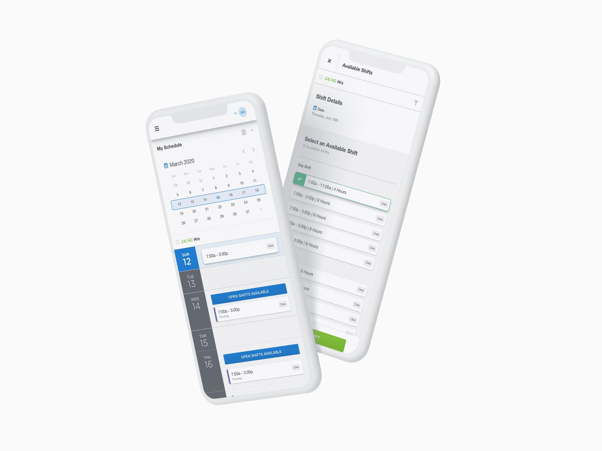
Employee versions of the schedule